Logos
On This Page:
- Primary Assets
- Secondary Assets
- Lockups
- Sub-Brands
- Incorrect Usage
- Folder Structure, File Naming and File Types
Primary Assets
NOTE: Guelph Gryphon brand assets can only be used by the Department of Athletics. Unless your unit/initiative is directly managed by the Department of Athletics, you are not allowed to utilize Guelph Gryphon brand assets in any context. Occasional exceptions may be granted, but must receive explicit permission from brandguide@uoguelph.ca.
Overview
Our logo is the visual representation of our brand, embodying our values, personality, and identity. As such, it should be central to all branding efforts and plays an integral role in building our brand equity and recognition.
The logo is an evolution of the University's original crest. This emblem connects us with U of G’s heritage and legacy, while evolving to meet the needs of our future. Supporting our emblem is our wordmark. This emphasizes our primary identifier (Guelph) with a slab-serif typeface that blends regal details with the modern impact. Together these elements create a unique and recognizable asset that epitomizes our brand values and positions the institution as a leading comprehensive university.
Primary Assets
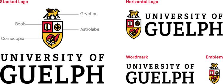
Having four different primary assets, ensures our visual identity is versatile and offers optimal performance within any application.
NOTE: It is always best to utilize the full logos. Avoid using the stand-alone wordmark or emblem, unless necessary.
- Stacked Logo: Best when centred within a design.
- Horizontal Logo: Best when left-aligned within a design.
- Wordmark: Best for small applications in which the emblem may be difficult to reproduce, or within restricted sizing that would be best fulfilled by the proportions of the wordmark.
- Emblem: Best for restricted sizing that would be optimized by the proportions of the emblem.
Clear Space
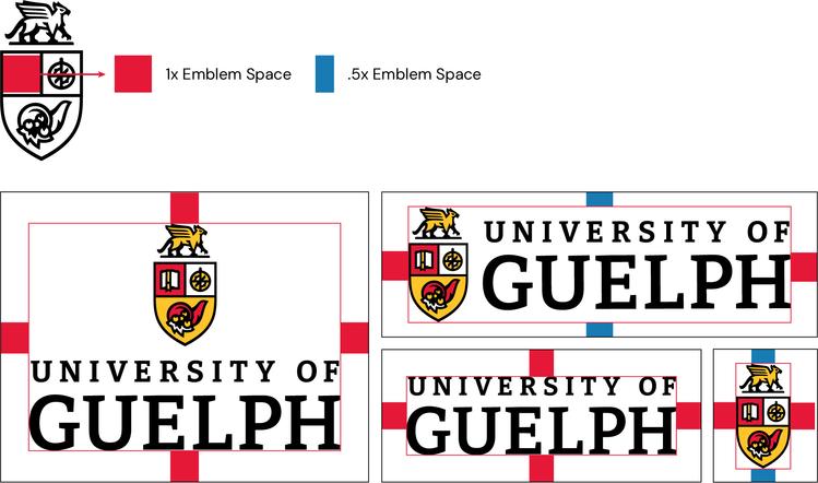
Surrounding our brand assets with defined clear space helps balance design work and reduce competition from nearby elements.
Clear space is measured using “emblem spaces”. One emblem space is the same width as the red square within our emblem.
Clear space is already built into the provided primary asset files. Just ensure that nothing impedes the bounds of an asset file, and you’re good to go!
Minimum Size
These assets should never be reproduced below the following minimum sizes. Some specific use-cases may require smaller sizing (i.e. custom pens), please connect with brandguide@uoguelph.ca prior to producing logos below the following dimensions.
- Stacked Logo: 1 inch tall
- Horizontal Logo: 0.5 inch
- Wordmark: 0.5 inch
- Emblem: 0.5 inch
Full Colour
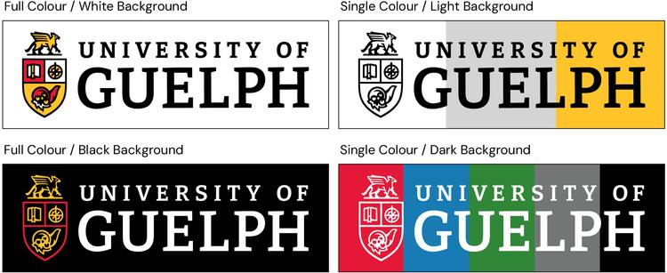
Our primary assets come in two different full colour versions, allowing for use on white and black backgrounds. The white background version should only be used on white backgrounds, and the black background version should only be used on black backgrounds. Do not utilize full colour logos on any background colour that is not black or white (i.e. red, gold, blue, etc.).
NOTE: This colour guide applies to all primary assets, not just the horizontal logos presented here as examples.
Single Colour
Our primary assets can also be used in a single colour (black or white) variation, allowing for use on any of our brand colours.
The black version can be used on light backgrounds (white, light gray, gold).
The white version can be used on dark backgrounds (red, blue, green, dark gray, black).
Photo Backgrounds
Either of the single colour variations can be used on photographic backgrounds, so long as they meet AODA standards for colour contrast. Single colour options offer more consistent colour contrast and often integrate more cleanly into photographic backgrounds.
Learn more about our colour palette and associated AODA requirements.
Different Assets for Different Results
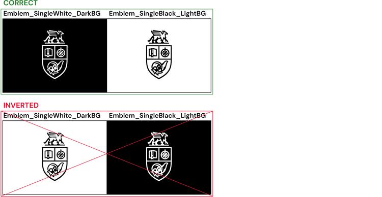
You may assume some assets are identical between light and dark background variations. This is not the case.
Each asset has been carefully optimized for its unique use-case.
For example, the weight of the emblem outline has been thinned for dark backgrounds. An optical illusion might make it appear identical to the light background version, but again, this is not the case. Be sure to only use assets for their specific, indicated use-cases.
Secondary Assets
Overview
Secondary assets should never overshadow or replace our primary assets and are mainly intended to improve the versatility of our brand. Use these assets to complement our primary assets, or in places where the primary assets are already clearly established.
U of G
The U of G letter-mark condenses our primary wordmark for use in smaller, more restrictive dimensions. Avoid using the U of G mark alongside the full University of Guelph logo/wordmark, as this can feel redundant.
The U of G mark is primarily used within our lockups and should only be used for internal facing initiatives. While “U of G” is commonly used across campus, externally it does not garner the same recognition as our full “University of Guelph” wordmark.
Improve Life
For more information on the meaning of Improve Life please see Our Commitment to Improve Life.
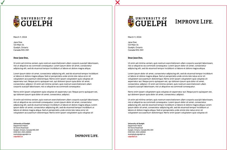
The Improve Life wordmark is intended to be used in conjunction with our primary assets, but not directly next to them. Improve Life is a critical component of our brand, but it must not compete with our primary assets. For example, if our horizontal logo is in the header of a document place the Improve Life wordmark in the footer. If you are creating a sweater with our stacked logo across the chest you can put Improve Life on the shoulder.
Technical Details
Colour: Our secondary assets can only be used in a single colour (black or white), allowing for use on any of our other brand colours. The black version can be used on light backgrounds (white, light gray, gold). The white version can be used on dark backgrounds (red, blue, green, dark gray, black).
Learn more about our colour palette.
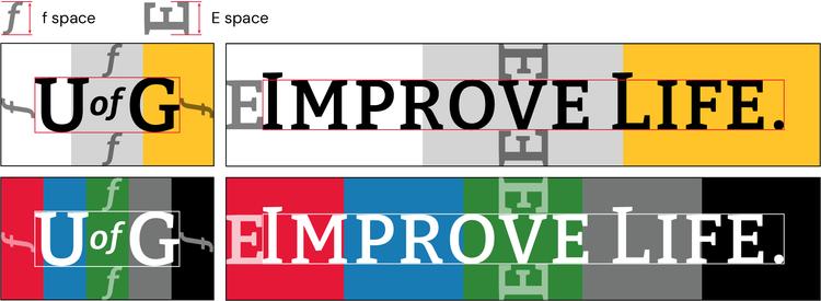
Clear Space: Clear space is already built into provided asset files. The U of G and Improve Life marks use “f” and “E” spaces respectively. The Improve Life mark uniquely measures clear spacing from the smaller letters, rather than the enlarged “I” and “L” which would typically define the graphic’s border.
Minimum Size: 0.5 inch
Lockups
Overview
Lockups allow colleges, departments, institutes, and initiatives an opportunity to promote their individual accomplishments, and celebrate their dedication to improving life. Lockups can include multiple lines of primary text for their unit's name (ex. College of Biological Science), and secondary text for their sub-unit's name, if applicable (ex. Department of Integrative Biology). Lockups are typically used in place of our primary assets, using them alongside primary assets should be avoided where possible.
To request a lockup, please email brandguide@uoguelph.ca with the name of your unit, and if applicable the name of your sub-unit.
U of G or University of Guelph?
Lockups with the “U of G” mark must be used for targeting internal audiences, or in places where the brand is already clearly established (i.e. our website).
Lockups with the full “University of Guelph” wordmark must be used for targeting external audiences, or when targeting both internal and external audiences. While “U of G” is commonly used across campus, externally it does not garner the same recognition as our full “University of Guelph” wordmark.
Technical Details
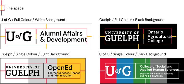
Colour: Each lockup is produced in 4 colour variations, following the same system as our primary assets. Learn how to utilize these colour combinations.
Clear Space: Clear space is already built into provided PNG files. SVG files require manual measurement. Lockups use "line” spaces to determine proper clear space. This is the height of 1 section of the dividing line, or 1/3 height of the full dividing line.
Minimum Size: 0.5 inch
Sub-Brands
Logos
Custom sub-branded logos (previously called “artmarks”) are reserved for high-impact, external facing, named entities who require a unique identifier to establish their work within competitive industries (i.e. Robotics Institute, CARE-AI, MiPARC, etc).
While there are countless examples of sub-brand logos that have been created over the University’s 150-year history, we are making a concerted effort to unify our brand. Off-brand logos undermine our branding efforts and visually divide our institution. In most cases, sub-brands are better served by aligning themselves with standardized U of G branding through a clean, unified, and effective lockup design.
While sub-brand logos offer a distinctive identifier, the sub-brand logo itself and all other brand components (writing, colour, typography, websites, etc.) must align with the overarching U of G brand. These logos also must be utilized alongside our primary assets whenever reasonable.
Requests
To request a custom sub-brand logo, please reach out to brandguide@uoguelph.ca.
NOTE: All sub-brand assets must be created in collaboration with C&M. Any assets created without C&M’s oversight will be considered brand violations. Learn more about Brand Governance.

Incorrect Usage
General Rules
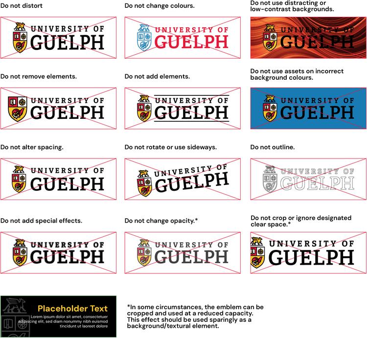
Misuse of our brand assets damages the strength and unity of our visual identity. Altering these assets in any way can significantly damage the impact and perception of our brand.
- Primary brand assets should be a focal point of all marketing and communication materials.
- Brand assets must not be modified in any way (changing colour, size, rotation, transparency, etc.).
- Assets should always be clearly legible, align with AODA requirements, and avoid distracting or low-contrast backgrounds.
- The U of G letter-mark and full University of Guelph wordmark should not be used together. Assets should be bold and impactful, not crowded, overused, or competing with one another.
The following are examples of how our assets should not be used, please note this is not an exhaustive list of incorrect usage. Although these examples utilize our horizontal logo, these principles apply to all brand assets, including all primary, secondary, and other assets (i.e. social media icons).
Do not manipulate an asset file in any way or (re)create your own asset file. If you are ever uncertain about how to utilize our assets or require assistance in creating branded materials, please reach out to brandguide@uoguelph.ca.
If you see an asset being used in a way that violates brand guidelines, please report your concern to brandguide@uoguelph.ca. No existing brand violation can be used as justification for similar or further violations.
Folder Structure, File Naming and File Types
File Naming Structure
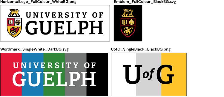
Each asset file utilizes the following naming convention:
AssetName_AssetColour_BackgroundColour.FileType
Folder Structure
The folder structure is built to maintain intuitive navigation while ensuring that assets are used correctly.
All assets are organized by asset type (i.e. Primary Assets), Colour (i.e. Full Colour), Background Colour (i.e. Black Background), and file type (i.e. PNG).
File Types
All asset files come in PNG and SVG formats. These each have their own strengths and weaknesses, but both formats can be used for building print and digital materials.
SVG files are vector graphics with infinite scalability. No matter the dimensions, these files will look crisp and detailed. They also offer smaller file sizes than PNGs and most other image file formats. SVGs are ideal for most situations.
PNG files are raster images with designated pixel dimensions. These can scale down in size very effectively but will become blurry and pixelated if enlarged past their set dimensions. This format is ideal for situations in which SVG files are incompatible (i.e. social media avatars).
