How to use the Lang logo
The Lang School logo is the most important part of the school’s brand. It must appear on all collateral representing the School.
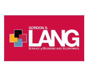
The main Lang logo is the preferred logo for the school. It is to be used for all print and digital marketing materials, for both internal and external audiences. The colours of the blocks should never be altered or changed in any way. To ensure the integrity and visual impact of the logo, it is important that the logo not be squished, elements separated or changed in size in relation to one another. When using the logo placement please follow the same rules as the Univesity of Guelph's logo on the brand guide.
Download Lang School logos on our resource pages
Correct!

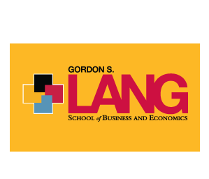
Logo usage on coloured backgrounds
When designing digital, print or apparel on coloured backgrounds, you may need to use an alternate version of the Lang logo with a thin white line around the four squares. The thin white line allows for the colours in the four-square icon to stand out on the coloured background.

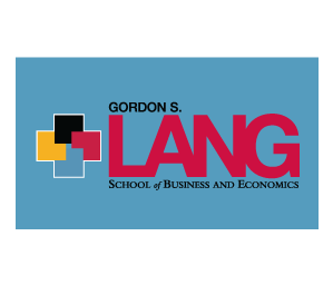
Download Lang School logos on our resource pages
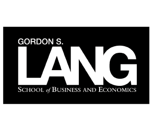
Secondary logo
Please use these versions only for black and white only. The logo should never appear in other colours.
Three options are black, red, white:


For video/digital use, the logo has been animated as a wheel, the blocks (the 4 years of the school) moving together as one. This animated endmark should be used to complete digital marketing materials such as videos and digital signage. Please use this version only.