Cross Tabulations
When you want to know how respondents answered on two or more questions at the same time, you will need to run a cross-tabulation. In order to do so, you must first determine which is your independent variable, and which your dependent variable, since the first is traditionally used as column headings and the latter are found in the row.
Independent variables explain or predict a response or an outcome, which is the dependent variable under study. As a basic rule, demographic information is usually considered independent, since characteristics such as gender, age, education etc. will normally determine the responses we make. If the variables being studied are not demographic, then the independent variable is determined by the study’s objectives. For instance, if the objective is to determine whether the level of satisfaction with the past holiday at a destination influences the likelihood of return, then level of satisfaction is our independent variable and the likelihood to return the dependent one.
This is the typical output of a simple cross-tabulation (of education levels and overall satisfaction with a holiday) as produced by SPSS, when we also ask that column percentage be calculated. Note that the title gives the two variables with the dependent one first separated by *. When producing this information in a table, we would reword it to read "Overall holiday satisfaction by highest level of education completed" ( see Table 1), removing all extraneous information and leaving it as a statement, not a question.
Overall satisfaction with your holiday * What is the highest level of education completed Crosstabulation
Obviously, you would not be able to use this table as is in a report. It requires ‘cleaning’. Your first consideration would be whether you want to keep all of the categories in your independent and dependent variable. This depends, of course, on what you are trying to illustrate and the responses in each cell. First of all, very few people have less than a high school degree, and we could therefore collapse the first two categories into ‘high school or less’. But that still leaves us with five categories or more detail than we would probably need. So we could collapse the categories ‘graduated from technical or vocational school’ and ‘some college/university’ into ‘some advanced education’ and the last two into ‘graduated from university or more’. Similarly, we notice that the level of satisfaction with the holiday is very high. Indeed, any rows with less than 5% of respondents in cells should be collapsed. At the very least we should only have one category ‘not at all or nor very satisfied’. This collapsing of categories is knows as recoding and is a way of changing existing variables or creating new variables based on existing data as explained by John Urbik, the Technical Marketing Specialist for SPSS.
The resultant cross-tabulation would look like this:
overall satisfaction with holiday * highest level of education Crosstabulation
| What is the highest level of education completed | Total | |||||||||
| Primary school (grade 1-7) | Some high school | Graduated from high school | Graduated from a technical or vocational school | Some college or university | Graduated from university | Graduated with an advanced degree | ||||
| Overall satisfaction with your holiday | Not at all satisfied | Count | 2 | 1 | 1 | 1 | 5 | |||
| % within What is the highest level of education completed | 0.60% | 0.40% | 0.50% | 1.10% | 0.40% | |||||
| Not very satisfied | Count | 2 | 6 | 8 | 8 | 2 | 1 | 2 | 29 | |
| % within What is the highest level of education completed | 6.70% | 1.80% | 3.00% | 4.00% | 1.40% | 0.40% | 2.20% | 2.20% | ||
| Somewhat satisfied | Count | 3 | 40 | 37 | 25 | 30 | 42 | 12 | 189 | |
| % within What is the highest level of education completed | 10.00% | 11.80% | 13.70% | 12.60% | 21.30% | 15.80% | 13.00% | 14.20% | ||
| Very satisfied | Count | 25 | 290 | 224 | 164 | 109 | 223 | 77 | 1112 | |
| % within What is the highest level of education completed | 83.30% | 85.80% | 83.00% | 82.80% | 77.30% | 83.80% | 83.70% | 83.30% | ||
| Total | Count | 30 | 338 | 270 | 198 | 141 | 266 | 92 | 1335 | |
| % within What is the highest level of education completed | 100.00% | 100.00% | 100.00% | 100.00% | 100.00% | 100.00% | 100.00% | 100.00% |
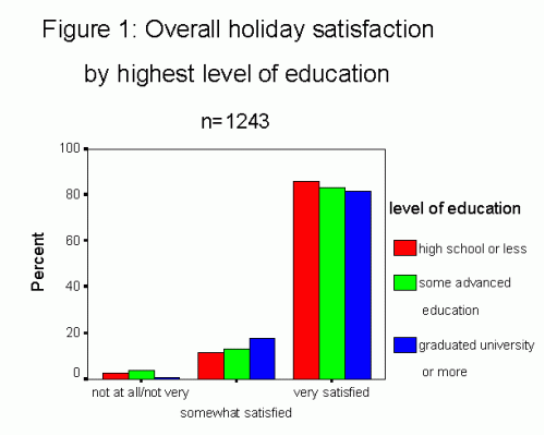
We can now proceed to present this information in a more pleasing table format by giving it the appropriate table number and title, indicating the total number of respondents who answered this question, and cleaning the table, as follows:
Table 1: Overall holiday satisfaction by highest level of education
n=1243
| Degree of Satisfaction | Level of education | ||
| High school or less | Some advanced education | Graduated university of more | |
| Not at all or not very |
10 2.7% |
18 3.8% |
3 .7% |
| Somewhat |
43 11.7% |
62 13.2% |
72 17.7% |
| Very |
315 85.6% |
388 82.9% |
332 81.6% |
| Total |
368 100% |
468 100% |
407 100% |
Graphically, we would follow very similar rules: the graph is numbered (Figure 1) with the same title and the number of respondents indicated; the independent variable identifies the columns since we want to compare the satisfaction level of each of the three education categories. It is the column percentage that is used for comparison purposes. The type of graph below is called a clustered bar chart.